Quick answer: A good pair uses one bold font for the headline and one plain font for everything else. Try Bebas Neue with Montserrat for sales posts, League Spartan with Libre Baskerville for tips, or Playfair Display alone in two weights for events. Keep it to two fonts, make the headline much bigger than the body text, and check that the text stands out from the background.
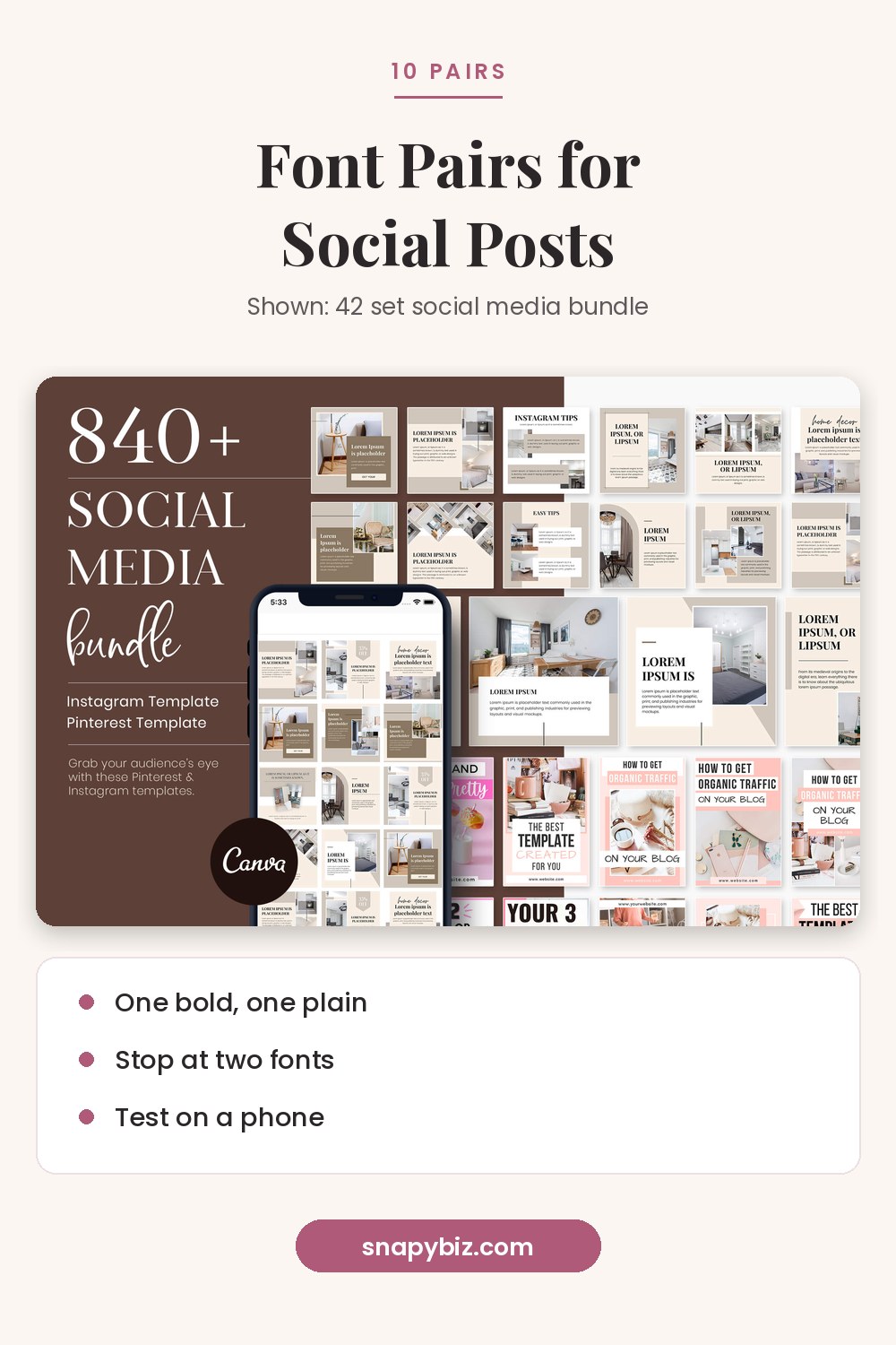

Social Media Template Bundle: 42 Canva Instagram Templates
$3.00
A social media template bundle with 42 editable Canva template sets for Instagram and Pinterest.
Get this templateFonts set the mood of a post before anyone reads a word. The pairs below all use fonts named in Canva’s font pairing guide, so you can find them in the Canva editor.
What makes two fonts work together?
Three simple rules:
- Contrast the jobs. One font grabs attention (the headline). The other is easy to read (the details).
- Match the mood. Both fonts should feel like they belong to the same brand, such as modern and clean, or soft and classic.
- Stop at two. Use size, weight and spacing to build levels before you add a third font.
Canva’s guide makes the same point in its own examples. It notes, for instance, that you “don’t have to use completely different fonts” and can use light and bold versions of one family instead.
Which combinations work best for social media?
| # | Headline | Body text | Best for |
|---|---|---|---|
| 1 | Bebas Neue | Montserrat | Sales, launches, fashion |
| 2 | League Spartan | Libre Baskerville | Tips, quotes, blog promos |
| 3 | Playfair Display Black | Playfair Display Italic | Weddings, events, invites |
| 4 | Raleway | Roboto Condensed | Workshops, webinars |
| 5 | Anton | Open Sans Light | Bold offers, gyms, trades |
| 6 | Sacramento (script) | Montserrat Light | Bakeries, florists, beauty |
| 7 | Source Sans Pro | Source Serif Pro | Long captions, carousels |
| 8 | Bodoni | Montserrat | Luxury, fashion, magazine style |
| 9 | Oswald | Montserrat Light | Data, stats, how to posts |
| 10 | Lora Bold | Lora Italic | Soft brands, quotes, coaches |
How does each pairing look?
1. Bebas Neue + Montserrat. Canva calls Bebas Neue a design favorite for headings, and says its contrast with Montserrat makes a “tidy and contemporary” pair. Use Bebas Neue in all caps for one short line, like “NEW DROP,” and Montserrat for the price and details.
2. League Spartan + Libre Baskerville. A strong geometric headline over a classic serif. Canva’s guide notes that a serif body font makes dense text easy to read, which suits tip posts and carousels.
3. Playfair Display, two weights. Canva suggests the heavy Black weight with the Italic for wedding and event designs. One family, two moods, zero clashing.
4. Raleway + Roboto Condensed. The round Raleway contrasts with the narrow Roboto Condensed. Good for event dates, times and speaker names.
5. Anton + Open Sans Light. Canva describes Anton as built to grab attention with a strong form, paired with Open Sans Light for contrast. Great for “50% off” style headlines.
6. Sacramento + Montserrat Light. Sacramento is a script font. Canva warns it is “best saved for headings” because too many script words get hard to read. Use it for one or two words, like “Fresh Bakes.”
7. Source Sans Pro + Source Serif Pro. Canva notes these two were made to work together. A calm choice for text heavy posts.
8. Bodoni + Montserrat. A classic magazine serif with a clean sans. It gives fashion and boutique posts a polished look.
9. Oswald + Montserrat Light. Oswald was redesigned for screens, says Canva’s guide. Its tall, narrow shape is great for big numbers.
10. Lora, two styles. Canva uses Lora’s italic and regular together to show how one family can look elegant. Ideal for quote posts.

How big should the text be?
There is no single right size, since post sizes differ. A simple test works better than a rule:
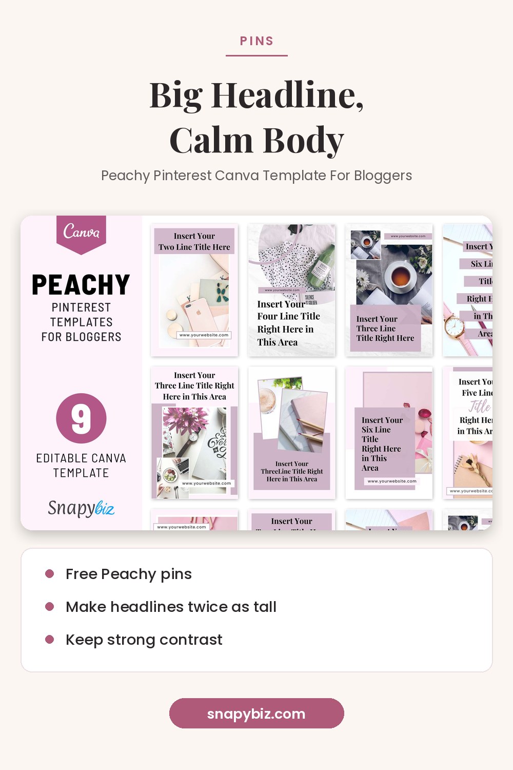
- Make the headline at least twice as tall as the body text.
- Shrink your design to phone size in Canva and read it from arm’s length.
- If you have to squint, make the body text bigger or cut words.
Instagram’s help page on photo sizes says photos are shared at a width of 1080 pixels, so design at that width and test on a real phone.
How do you keep text readable on photos?
The W3C’s contrast guide for the web sets a minimum ratio of 4.5:1 for normal text and 3:1 for large text. Social posts are not web pages, but the rule is a good target. Easy ways to hit it:
- Put text on a solid color block, not on a busy part of the photo.
- Darken the photo or add a see through shape behind the text.
- Avoid thin script fonts on top of photos.
- Use white or black text; pale gray on white often fails.
How do you set up fonts so they stay the same?
Save your pair so every post matches. Canva’s Brand Kit guide explains how to store your brand fonts, colors and logos in one place. Canva’s brand fonts guide covers uploading your own fonts, which is a paid plan feature. The pairings above use fonts already in the Canva editor, so you don’t need to upload anything.
Free and low cost templates to try these pairs
| Template | What you get | Price on Oct 21, 2026 |
|---|---|---|
| Free flower post | 1 Instagram post, 1080 x 1080 px | $0.00 |
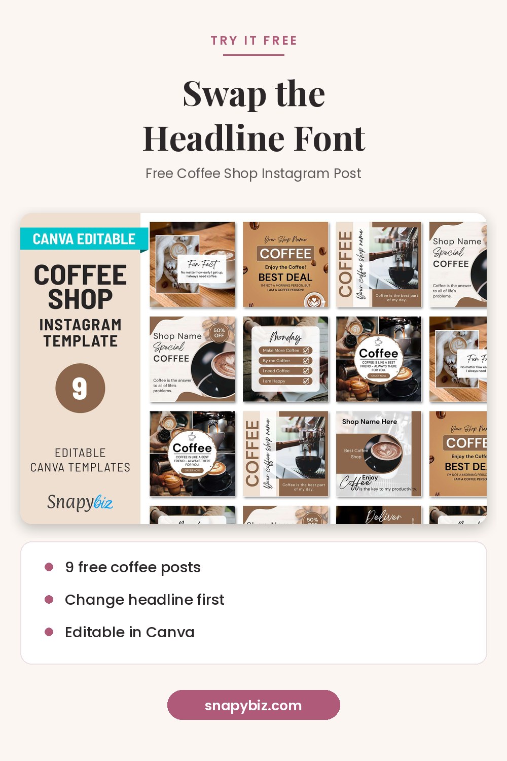
| Free coffee shop posts | 9 Instagram posts | $0.00 |
| Free Peachy pins | Pinterest pins for bloggers | $0.00 |
| 42 set social bundle | 42 sets of posts, stories, highlight covers and pins | $3.00 |
| Carousel pack | 130 carousel templates | $3.00 |

Free Flower Instagram Canva Social Media Templates
Free
Design beautiful, eye catching posts with Free Flower Instagram Canva Social Media Templates, perfect for easy editing and stunning floral branding.
Get this template

Swap the fonts in any template to test a new pair. Change the headline font first, then the body.
Common font mistakes
| Mistake | Fix |
|---|---|
| Two similar sans serif fonts | Pair a sans with a serif or a script |
| Three or more fonts | Cut to two and use weights instead |
| Script font for long text | Use script for one to three words only |
| All caps body text | Save caps for short headlines |
| Tiny text on a busy photo | Add a color block or make it bigger |
Frequently asked questions
What is the best font combination in Canva?
There is no single best one. Bebas Neue with Montserrat is a safe start for bold posts, and League Spartan with Libre Baskerville works well for tips and quotes.
How many fonts should a social media post use?
Two is plenty. Use bold and light weights of the same fonts to build levels.
Are these fonts free in Canva?
They all appear in Canva’s own pairing guide and in the editor’s font list. Check for a crown icon, which marks paid items.
Can I use my own brand font in Canva?
Yes, on a paid plan. Canva’s brand fonts guide explains how to upload it to your Brand Kit.
How do I make text easy to read on a photo?
Place text on a solid shape or a dark area of the photo, and aim for strong contrast between text and background.
Summary
The best Canva font pairings use one attention font and one easy reading font. Pick a pair, stick to two, and make the headline much bigger than the details. Test on a phone, keep strong contrast, and save your pair in a Brand Kit. Then try your favorite combination on a free SnapyBiz template.
References
- Canva. Guide to font pairing.
- Instagram Help Center. Photo resolution and sizes.
- W3C. Understanding success criterion 1.4.3: Contrast (minimum).
- Canva Help Center. Set up Brand Kits.
- Canva Help Center. Upload and use Brand Kit fonts.